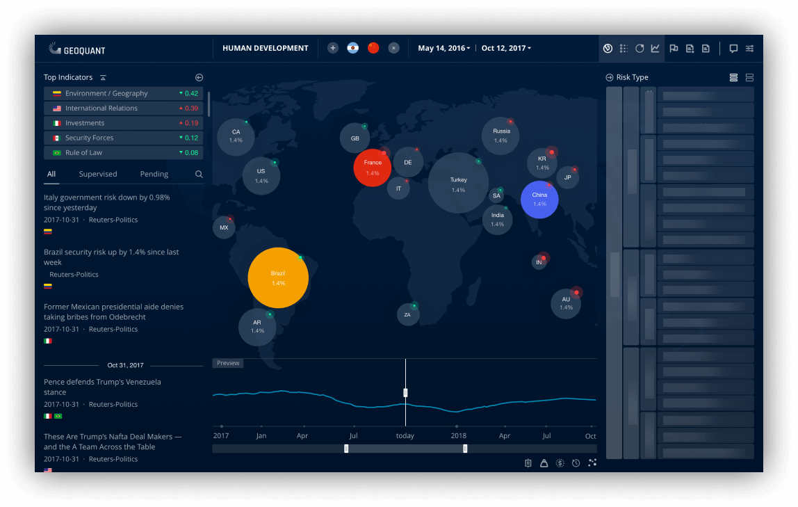
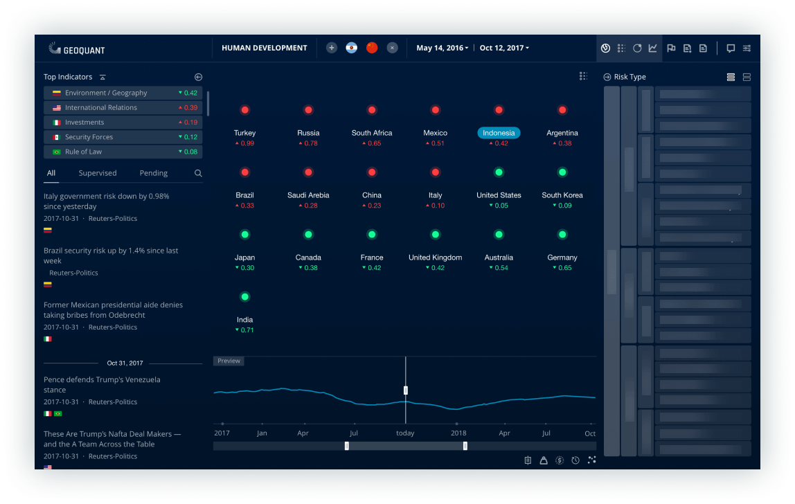
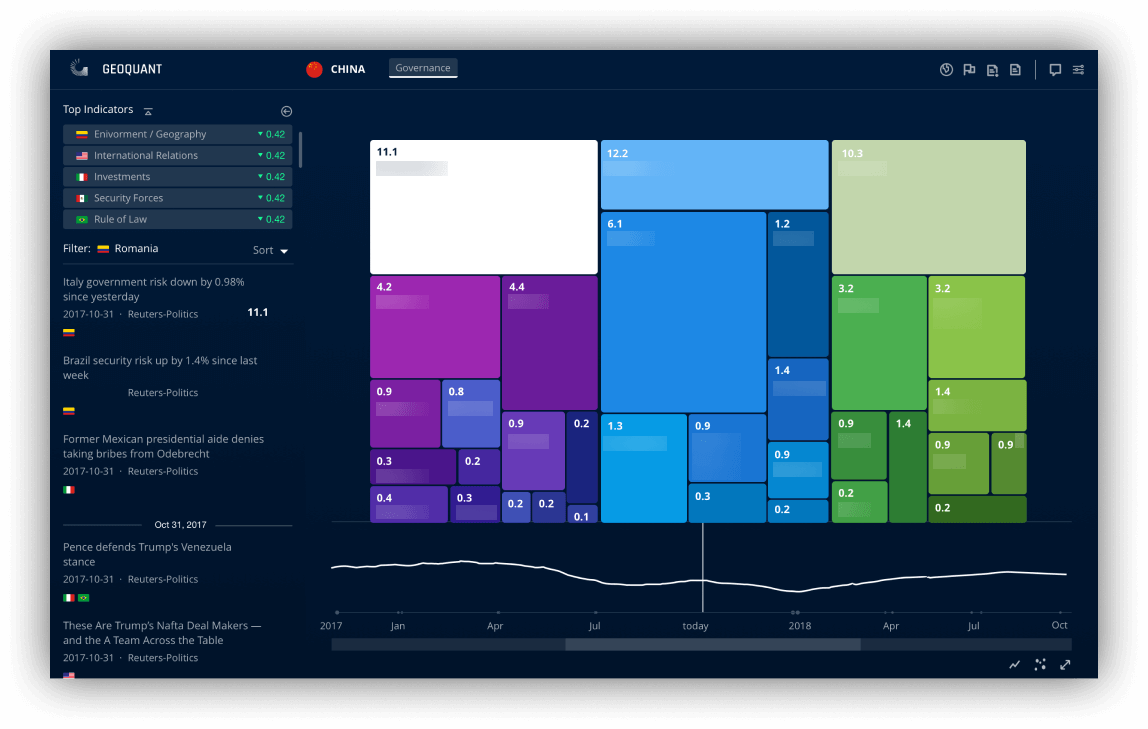
Geoquant Webapp

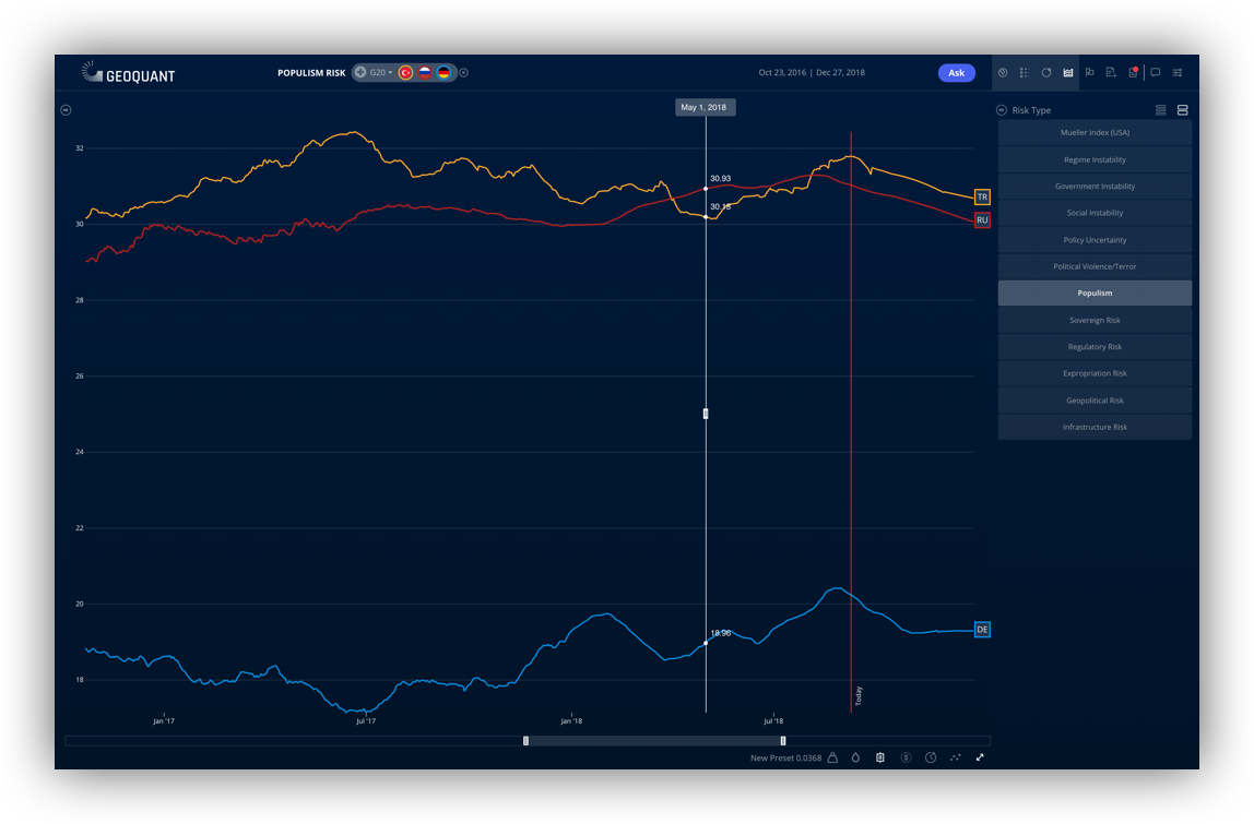
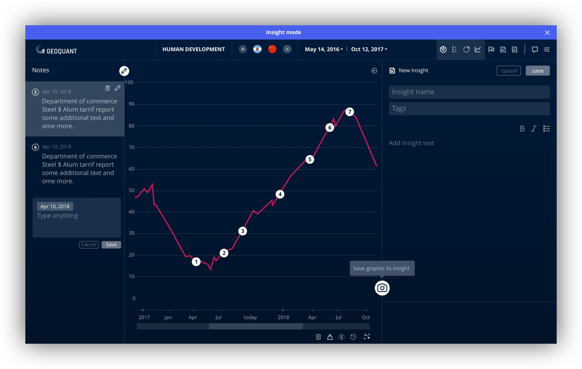
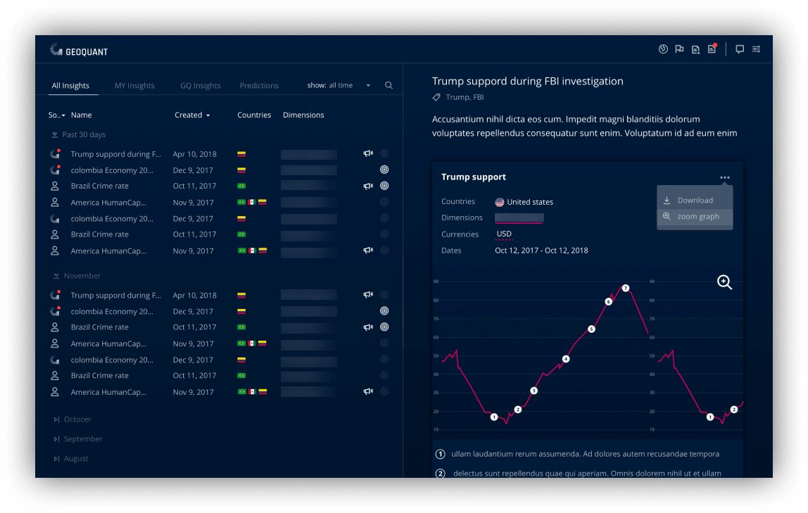
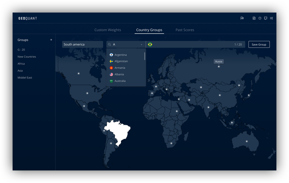
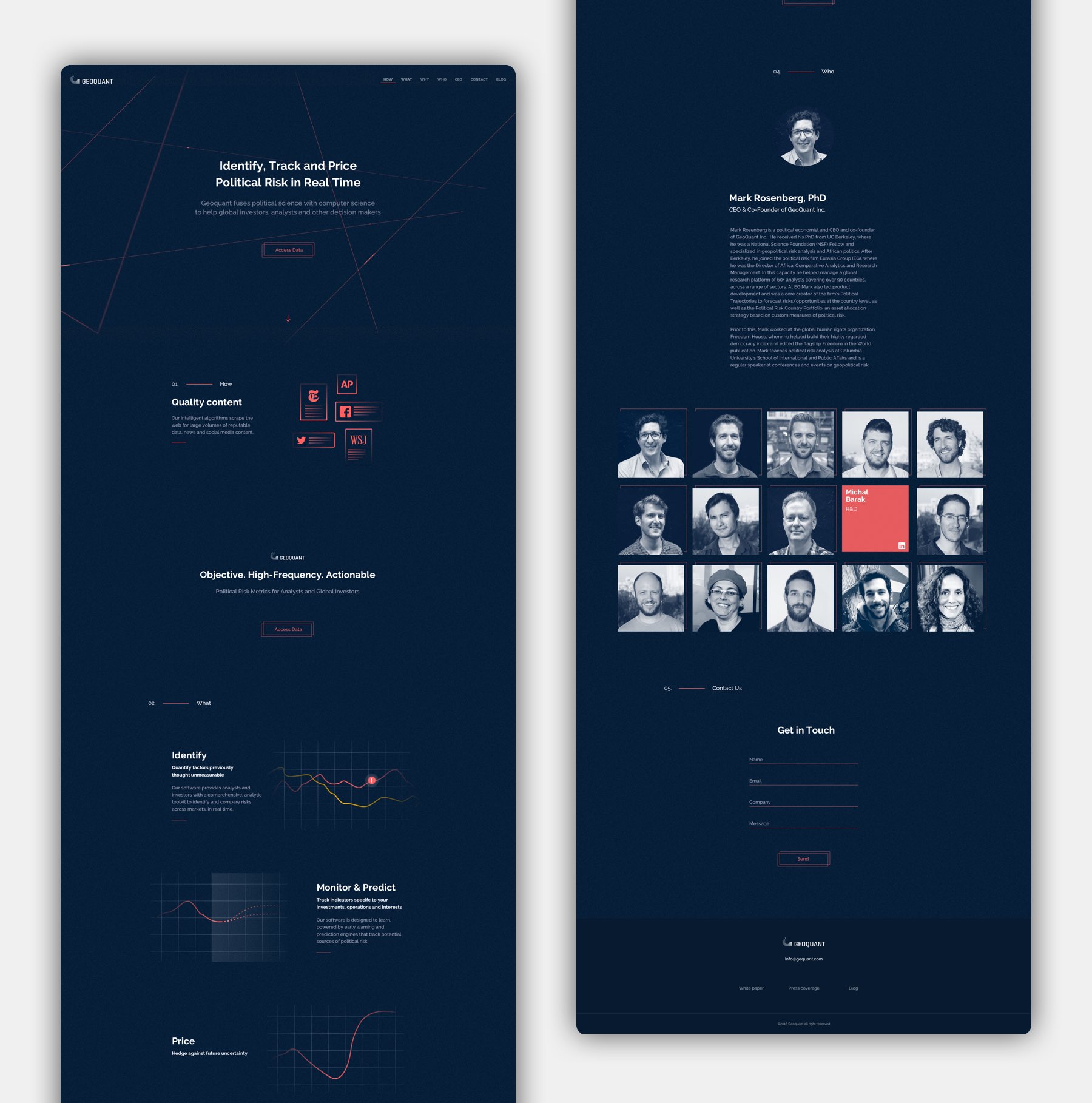
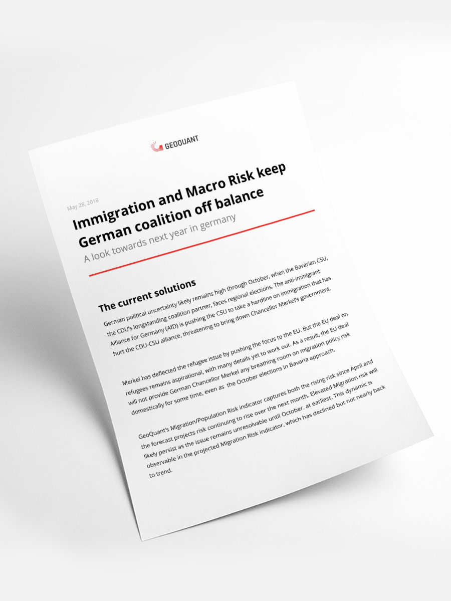
Geoquant is a startup company that measure and quantify political risk in the world throughout the use of AI, machine learning and algorithms. In the past year I've been the lead product designer at Geoquant. Along side with designing the main web app, I was also responsible for the company website, Identity and marketing materials.

Role
Product design, UI/UX, Art direction, Prototyping, Motion design, Illustrations, Iconography, Website, Marketing.
Client
Geoquant
Date
2017 - 2018
Launch website

Geoquant Webapp Case Study

Some Elements were hidden in order to keep proprietary information confidential

Main Dashboard

The main dashboard was designed to give the analyst a quick overview of all recent dramatic events, as well as the fastest way to filter only what is relevant for him.

Data Visualisation

We created 4 different views that allow the analyst more control the arrangement the data. In turn that will allow him to come up with better and more relevant insights.
A tree map was the best way to present the hierarchy in a quick glance that is both easy to understand and visually pleasing.

The Graph

The graph is where the analyst can really start see and evaluate different aspects and trends. This tool was built from the ground up. It has countless  view options and can compare more then 50 different parameters for more the 30 countries.

Insight Editor

We decided to give our users the option to write their insights directly in the app. To do that we had to create a tool that will allow them to save and annotate the data. We also introduced a new widget where they can write and format text and export it as a PDF report.

Insights & Predictions

Once an insight is published, it’s being added to the pool of all insights created in the app, and other team member can view it and base their own predictions on existing insights. Insights can be exported as PDF file, or be shared with other users. They can also turn to a prediction that may affect the entire data presented by the app.

Options & settings

Users can create new groups of countries to control what data the see.

The analysts can affect the way the data is being calculated by the app algorithms by changing the score for each parameter, and create a new model. They can create multiple models and compare between them until they find the best one for them.

Visual langage

We knew that most of out users would find the app very different from the way they used to do their work in the past. That is why we decided we want to go with a slick and sexy look. A dark theme and bold colors that will give our users a futuristic feeling, and that it is different from all they know about political risk analysis.
It had to be visually satisfying to see how data can appear, and how it can be understood better. We insisted to take care of all details, from the login screen to the notification emails, all had to speak the same language, look polished and trustworthy.

Geoquant Website & branding

Next Project

Superwise